Citrus Homes

Citrus Homes

Details

project scope:
logo, visual identity, branding, UI, art direction

project role:
lead designer

Citrus Homes came to me for a new brand identity. Their company did not have a logo or cohesive design system in place, hindering their high quality work.  I designed a new visual identity system that would give Cirtus Homes a strong and cohesive look, from their logo to various brand touchpoint. craftsmanship.

In our collaboration, we identified a few key points they wanted their branding to reflect – no nonsense craftsmanship, an ode to Southern California lifestyle and their name, and their down-to-earth approach to business. This foundation allowed me to shape the art direction and brand styles into something strong, memorable and exactly them.

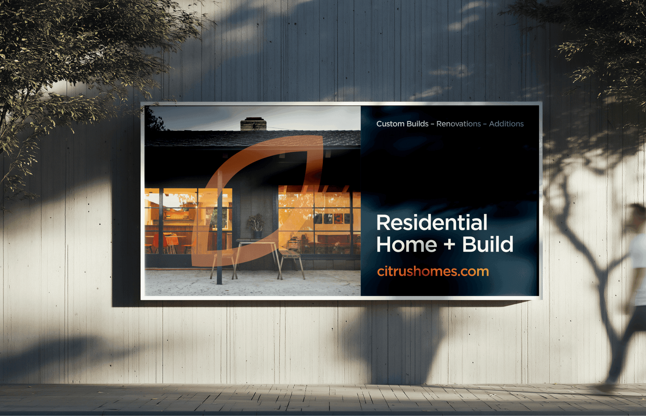
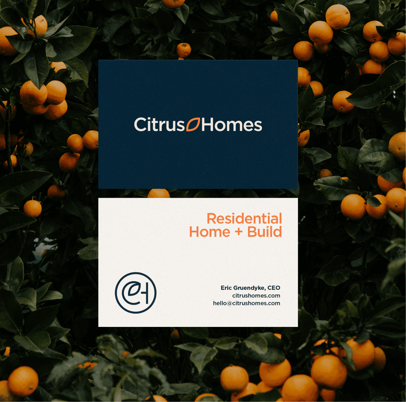
Their new brand identity was able to reflect these qualities in multiple ways. A minimal logo system reflects their down-to-earth, no nonsense mindset, while the typography system uses Gotham, always in sentence case, which makes the brand feel strong and approachable. To round it out, the chosen color palette reflects both the blue collar work ethic and nods to California; the calm of the ocean, and the energy and brightness of citrus orange. 

I was responsible for the project from start to finish, guiding Eric and his team through art direction, logo systems and brand touch points (signage, apparel, website direction, etc). The result is a high-end identity that matches their high-end work and craftsmanship, showing their customer base, and potential customers, they are an expert and leader in their field.
How I brought a small business to life visually ––

Eric, CEO, came to me to build out a visual identity for Citrus Homes. From the start, it was clear that this small team took great pride in their craftsmanship and family-run start. Their modesty in producing highly skilled work for their clients was something to be celebrated and showcased through design choices and brand touch points.

The result is a brand that feels quiet but confident. The choice of typography and minimal logo is a direct reflection of their “no fluff” nature – serious about their craft but honest and approachable.

Drawing canvas
Drawing canvas
Camera
Camera
Drawing canvas
Drawing canvas
Drawing canvas
Drawing canvas
Process

Through initial conversations and moodboard selections, it was clear Citrus Homes was after a clean, modern mark inspired by their namesake and California culture that would be easy to apply on various applications. Our finished logo and identity system let us create those impactful pieces through color and bold typography and an iconic logomark for brand recognition.

Questions I had to ask myself:
1. How can we come across confident through type, color and imagery?
2. How can we blend the calming nature side of Southern California culture with
grit and modesty?

Camera
Drawing canvas
Camera
Camera
Camera
Drawing canvas
Drawing canvas
Drawing canvas
Citrus Homes mobile view